
Dataviz
18 March 09. [link] PDF version
This is a continuation of last episode.
That said, let's start with a little exercise.
The first figure is a TrellisTM or lattice plot, giving a 2-D dot plot of each of three variables against each other variable. I didn't try too hard in producing the plot, and just pulled out three variables at random from a random data set.
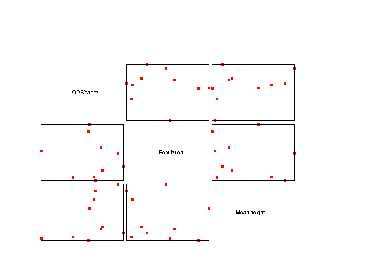
Figure One: A lattice plot, relating three variables to each other
But we can already see some patterns: GDP/capita and height have the positive correlation you'd expect, as per the blow up in the next figure. In this figure, I fit a linear regression to the data, and it looks pretty good, but for a few outliers at lower right. Maybe an exponential-family model may fit better.
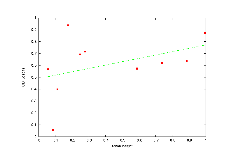
Figure Two: A close-up of the upper left plot in the lattice, with the line of best fit
So that's DataViz at work. We took a lot of data, displayed many
relations at once, and zeroed in on one that matters.
Except, uh, for all that I said about this being a random data set. I just made up some pleasant-sounding variable names, generated a random data set, and plotted it. And yet we were able to find a plausible pattern in there.
And so we see another way of casting the descriptive versus inferential war--the problem of too many hypothesis tests. The descriptivists are working to produce methods like the lattice plot that let you see more relationships at once; the inferentialists are asking: if you fed complete noise to this method, what are the odds that some sort of pattern would turn up? As our methods get better at putting more data on the screen at once, they get worse at testing whether the patterns we see are real or just beautiful noise.
DataViz
Thanks to a number of technological advances, dataViz is trendy right now. There are a few icons of the field who are working hard on self-promotion, such as Edward Tufte, whose books show how graphs can be cleaned up, chartjunk eliminated, and grainy black and white fliers from the 1970s cleaned up through the use of finely detailed illustrations in full color. John Tukey's Exploratory Data Analysis (cited above) is aggressively quirky, and encourages disdain for the inferential school.
These guys, and their followers, are right that we could do a whole lot better with our data visualizations, and that the stuff based on facilitating fitting the line with a straightedge should have been purged at least twenty years ago. Strunk and White gave us standards for writing clearly in 1959; it's about time we developed guidelines for exposition via graphics.
But we're talking not just about presenting a known relationship, but exploratory data analysis via graphics. In this context, the underlying philosophy is humanist to a fault. The claim is that the human brain is the best data-processor out there, and our computers still can't see a relationship among a blob of dots as quickly as our eye/brain combo can. This is true, and a fine justification for better graphical data presentation. And hey, we humans would all rather look at plots than at tables of numbers.
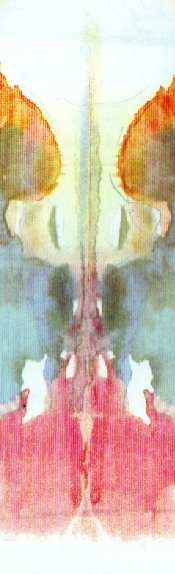
Figure Three: If you don't see faces, you're crazy. Oh, and there's a penis and vagina in every inkblot too.
But apophenia is a powerful force. We look at clouds and see bunnies, or read the horoscope and think that it's talking directly to us, or listen to a Beatles song about playground equipment and think it's telling us to kill people. Given a handful of scatterplots like the lattice plot above, you will find a pattern--in fact, if a psychologist were to show you a series of ten seemingly random inkblots and you didn't see a reasonable number of patterns in them, the psychologist might consider you to be mentally unhealthy in any of a number of ways.
The moral here is that our data visualization technology is getting really good really fast--I'll have even slicker examples next time. You'd be silly to ignore these recommendations and novel display methods. But the same power that makes patterns clear is the power that invents random patterns in static.
Next time: even more dataviz tools, which touch on an even bigger problem.
[Previous entry: "Too many tests"]
[Next entry: "Crowdsourcing data mining"]