
Overlapping bus lines
03 March 15. [link] PDF version
I have at this point become a regular at the Open Data Day hackathon, hosted at the World Bank, organized by a coalition including the WB, Code for DC and the hyperproductive guy behind GovTrack.us.
This year, I worked with the transportation group, which is acting as a sort of outside consultant to a number of cities around the world. My understanding of the history of bus lines in any city is that bus lines start off by some enterprising individual who decides to buy a van and charge for rides. Routes are decided by the individual, not by some central planner. With several profit-maximizing competitors, especially lucrative routes will be overcrowded with redundant lines relative to what a central planner could do, taking into account congestion, pollution, even headways, and system complexity.
Many places see a consolidation. For example, the Washington Metro Area Transit Authority was formed by tying together many existing private lines. Over the course of decades, some changes were made to consolidate. The process of tweaking the lines from the 1900s still slowly continue to this day.
Measuring overlap
Here's where the data comes in. A Bank project [led by Jacqueline Klopp and Sarah Williams] developed a map of Nairobi's bus maps, by sending people out on the bus with a GPS-enabled gadget, to record the position every time the bus stopped. The question the organizers [Holly Krambeck, Aaron Dibner-Dunlap] brought to Open Data Day: how much redundancy is there in Nairobi's system, and how does it compare to that of other systems?
We defined an overlap as having two stops with latitude and longitude each within .0001 degrees of each other: roughly 90 meters, which is a short enough walk that you could point and say `go stand over there for your next bus'. It also makes the geographic component of the problem trivial, because we can just ask SQL to find (rounded) numbers that match, without involving Pythagoras.
GTFS data is arranged in routes, which each have one or more trips. We considered only route overlaps, which may have a significant effect on our final results if night bus trips are very different from day bus trips. Modifying the code below to account for time is left as a future direction for now.
The data for Chicago's CTA, Los Angeles, and the DC area's WMATA have both bus and subway/el routes.
On the horizontal axis of this plot, we have the percent overlap between two given routes, and on the vertical axis, we have the density of route pairs, among route pairs that have any overlap at all. In all cities, about 90% ($\pm$2%) of routes have no overlap, and are excluded from this density.
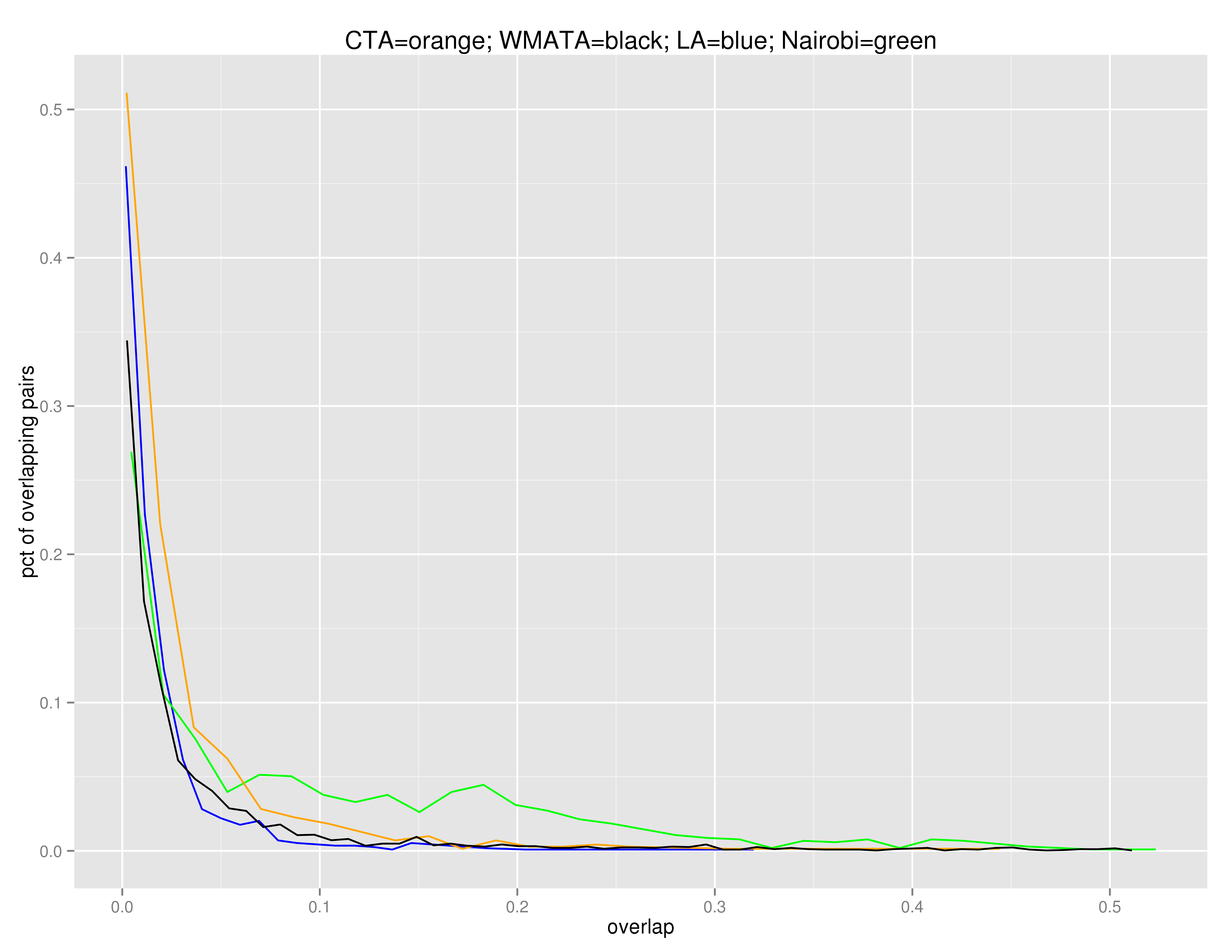
The hunch from our WB transportation experts was right: WMATA, LA, and CTA have pretty similar plots, but Nairobi's plot meanders for a while with a lot of density even up to 30% overlap.
The map and the terrain
The ideal bus map would form a grid in a perfect world. For example, Chicago is almost entirely a grid, with major streets at regular intervals that go forever (e.g., Western Ave changes names at the North and South ends, but runs for 48km). The CTA's bus map looks like the city map, with a bus straight down each major street. The overlap for any N-S bus with any E-W bus is a single intersection. The routes that have a lot of overlap are the ones downtown, along the waterfront, and on a few streets like Michigan Ave.
Further East and in older cities, things fall apart and the ideal of one-street-one-bus is simply impossible.
Thad Kerosky fed the above data to QGIS to put the stops that have nonzero overlap on a map:
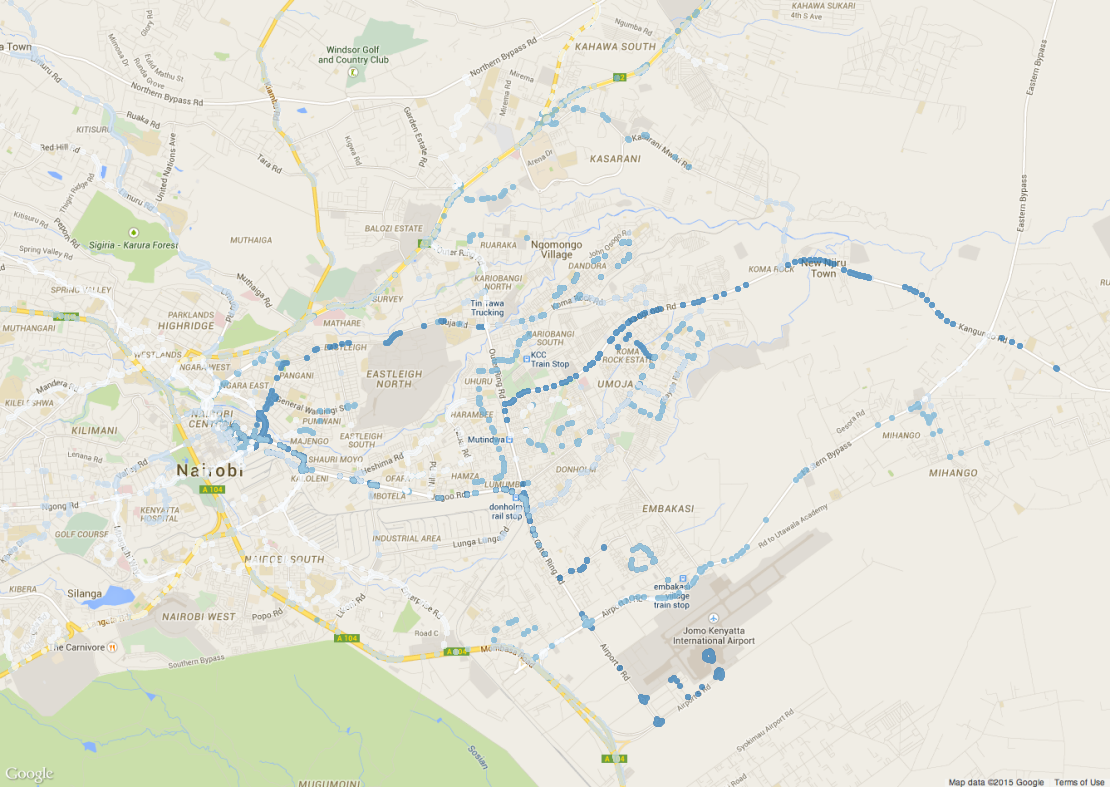
The bus overlaps basically produce a map of the major arterial roads and major bottlenecks in the city grid (plus the airport).
So the problem seems to partly be geography, and there's not much that can be done about that. The last time a government had the clout to blow out the historic map to produce a grid was maybe 1870, and there aren't any countries left with Emperors who can mandate this kind of thing. But that doesn't preclude the possibility of coordinating routes along those arteries in a number of ways, such as setting up trunk-and-branch sets of coordinated schedules.
How to
Keeping with the theme of not overengineering, we used a set of command line tools to do the analysis. We had a version in Python until one of the team members pointed out that even that was unnecessary. You will need SQLite, Apophenia, and Gnuplot. We also rely on a GNU sed feature and some bashisms. It processes WMATA's 1.6 million stop times on my netbook in about 70 seconds.
Start off by saving a GTFS feed as a zip file (this is the norm, e.g., from the GTFS Data Exchange), save this script as, e.g., count_overlaps, then run
Zip=cta.zip . count_overlaps
to produce the pairs table in the database and the histogram for the given transit system.
The script produces individual plots via Gnuplot, while the plot above was via R's ggplot, which in this case isn't doing anything that Gnuplot couldn't do.
#!/usr/bin/bash   #uses some bashisms at the end

if [ "$Zip" = "" ] ; then
  echo Please set the Zip enviornment variable with the zip file with your GTFS data
else #the rest of this file

base=`basename $Zip .zip`
mkdir $base
cd $base
unzip ../$Zip

DB=${base}.db

for i in *.txt; do sed -i -e 's/|//g' -e "s/'//g"  $i; done
for i in *.txt; do apop_text_to_db $i `basename $i .txt` $DB; done

sqlite3 $DB "create index idx_trips_trip_id on trips(trip_id);"
sqlite3 $DB "create index idx_trips_route_id on trips(route_id);"
sqlite3 $DB "create index idx_stop_times_trip_id on stop_times(trip_id);"

sqlite3 $DB << ——

create table routes_w_latlon as
    select distinct route_id, s.stop_id, round(stop_lat, 4) as stop_lat,
       round(stop_lon, 4) as stop_lon
       from stops s, stop_times t, trips tr
       where s.stop_id = t.stop_id
       and tr.trip_id=t.trip_id ;

create index idx_trips_rid on routes_w_latlon(route_id);
create index idx_trips_lat on routes_w_latlon(stop_lat);
create index idx_trips_lon on routes_w_latlon(stop_lon);

create table pairs as
  select routea, routeb,
    ((select count(*) from
     (select distinct * from
     routes_w_latlon L, routes_w_latlon R
     where
     L.route_id = routea
     and
     R.route_id = routeb
     and L.stop_lat==R.stop_lat and L.stop_lon==R.stop_lon))
    +0.0)
    / (select count(*) from routes_w_latlon where route_id=routea or route_id=routeb)
     as corr
    from
    (select distinct route_id as routea from routes),
    (select distinct route_id as routeb from routes)
    where routea+0.0<=routeb+0.0;
——

cat <(echo "set key off;
set xlabel 'Pct overlap';
set ylabel 'Count';
set title '$base' ;
set xrange [0:.6];
set term png size 1024,800;
set out '${base}.png';
plot '-' with impulses lt 3") <(apop_plot_query -f- -H0 $DB "select corr from pairs where corr > 0 and corr < 1"| sed '1,2d') | gnuplot

fi
[Previous entry: "m4 without the misery"]
[Next entry: "Banning the hypothesis test"]